
NOK / CASE 05FOCUS2026
Finding order
in complexity.
A visual identity for a real-time analytics product, built around patterns, rhythm and convergence.
ScopeBrand strategy & identity
SystemCustom wordmark & app icon
ProductReal-time analytics

Complex data needs clear structure.
FOCUS is a real-time revenue and sales analytics product within the Posense ecosystem.
Its identity needed to feel precise and intelligent without falling into the predictable visual language of dashboards, targets or lenses.
02 / Natural order
Complex data. Natural clarity.
The starting point came from systems that already know how to organise complexity.
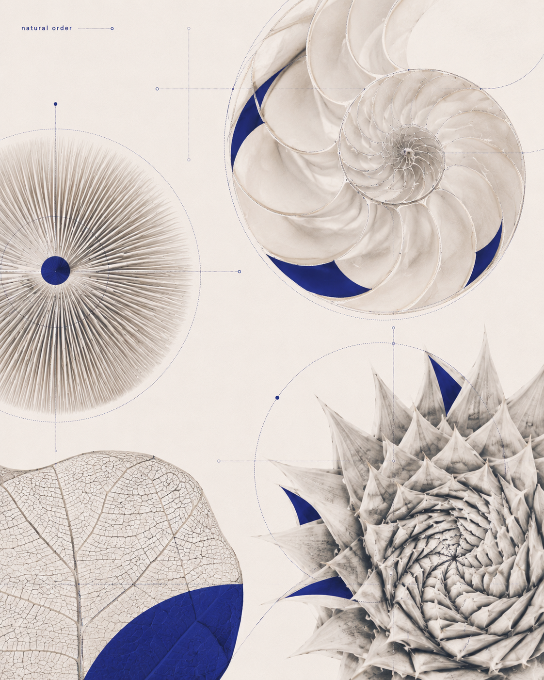
SpiralRepetitionCentreConvergenceRhythmBalance
03 / Pattern → form
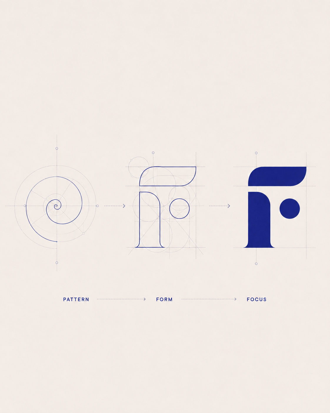
From patterns to perspective.
Organic behaviours were translated into controlled geometry. The goal was not to imitate nature, but to use its logic.
04 / Custom letter system
Structure becomes character.
The FOCUS wordmark was drawn from a shared vocabulary of arcs, cuts, counters and focal points.

05 / Anatomy
A system built from parts.
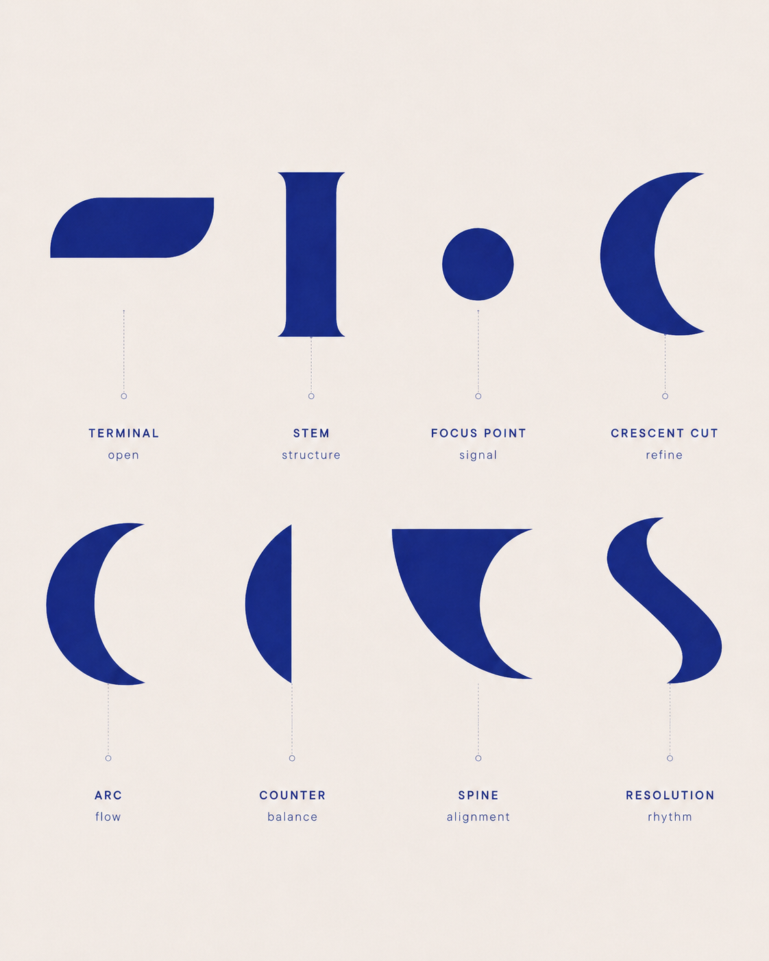
Terminalopen
Stemstructure
Focus pointsignal
Crescent cutrefine
Arcflow
Counterbalance
Spinealignment
Resolutionrhythm
06 / Reduction
One system. Reduced to one signal.
The same visual grammar scales down into a standalone F, creating an app icon without introducing a separate symbol.

07 / Final identity
Every signal, brought into focus.
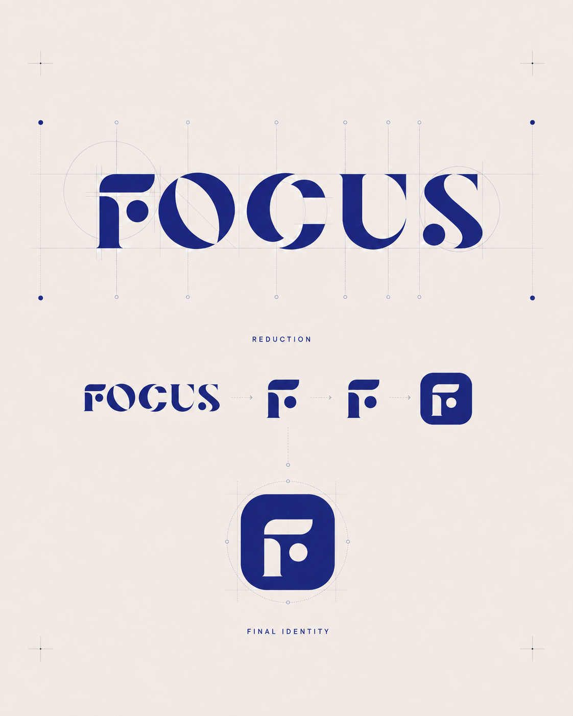 Digital product identity