
McDelivery,
ordered better.
A responsive commerce experience built to make choosing, customising and ordering feel fast on every screen.
Ordering food should not feel like work.
McDelivery needed a clearer path through a large menu, campaign structure and checkout flow—particularly on smaller screens, where every unnecessary decision adds friction.
nokstudio redesigned the experience around three priorities: reduce cognitive load, surface useful information earlier and keep the route to checkout short. The result is one coherent ordering system that adapts from mobile to desktop without changing its underlying logic.
Less searching
Prioritise repeat behaviour, categories and active campaigns.
Earlier certainty
Make price, contents and order status visible before they become questions.
One familiar system
Keep navigation and decision patterns consistent across screen sizes.
The shortest screen gets the clearest decisions.
Mobile is treated as the core ordering environment—not a reduced desktop layout. Content density, touch targets and action priority are designed around one-handed, high-intent use.
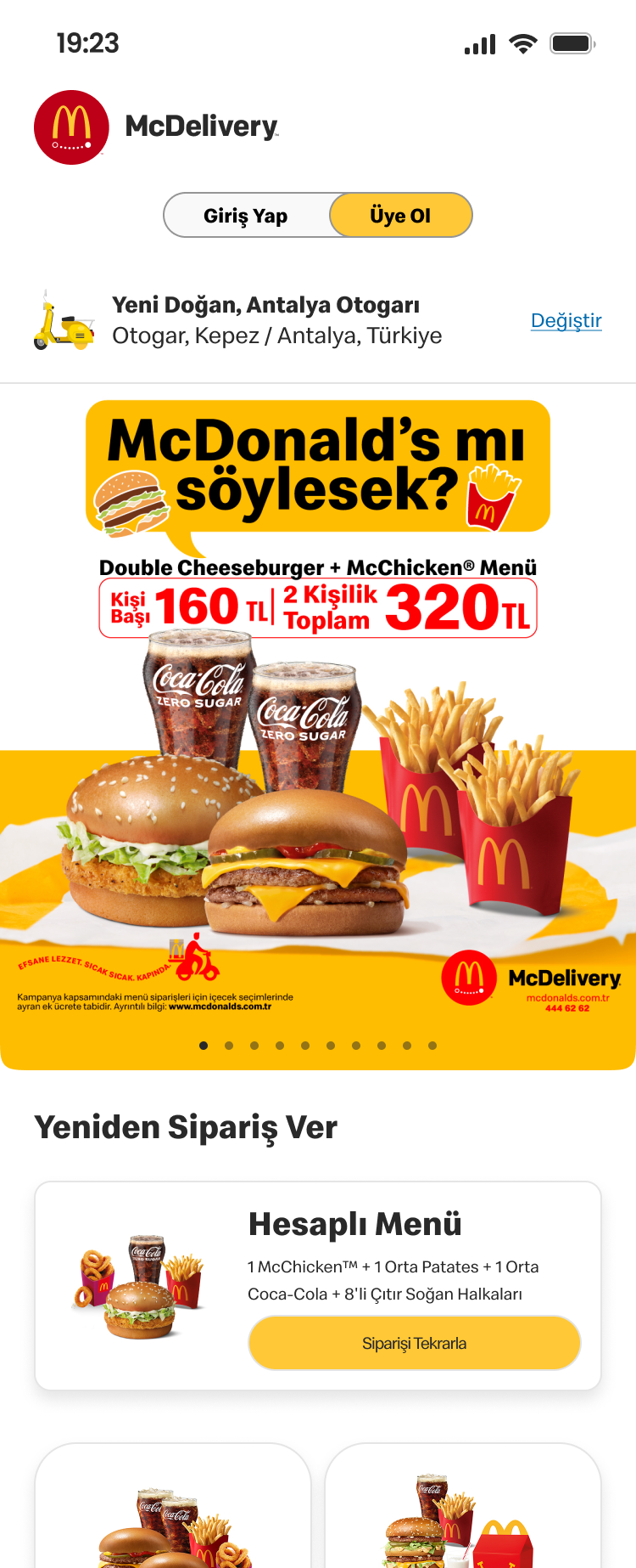
Discover without the detour
Campaigns, repeat orders and core categories are surfaced immediately. The home experience gives returning customers a direct route back to familiar choices while keeping seasonal offers visible without dominating the journey.
- Campaign hierarchy
- Quick reorder
- Category access
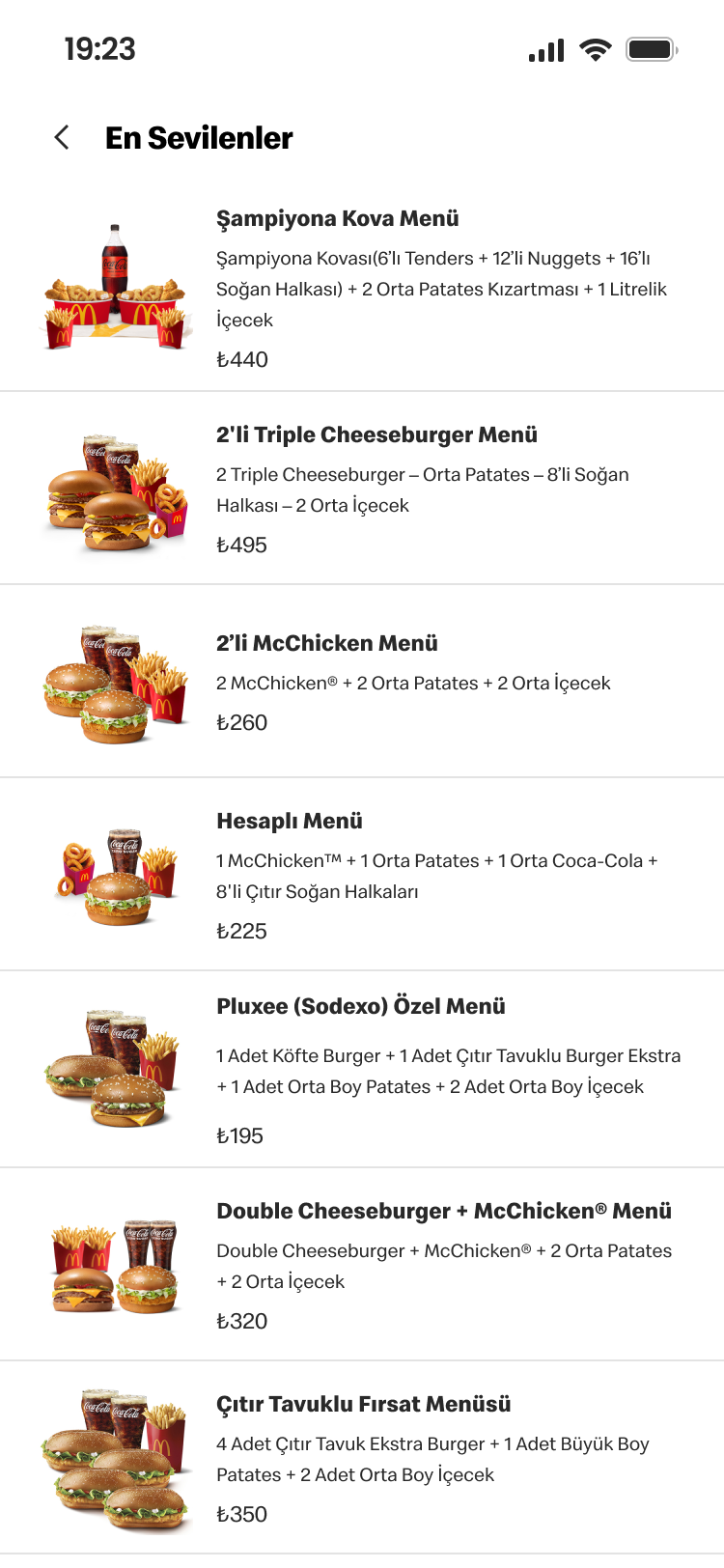
Scan the menu at speed
A compact list structure brings product imagery, pricing and essential details into a clear scanning rhythm. Persistent category navigation preserves context across a deep menu and helps customers compare options with less scrolling.
- Dense product list
- Price visibility
- Persistent navigation
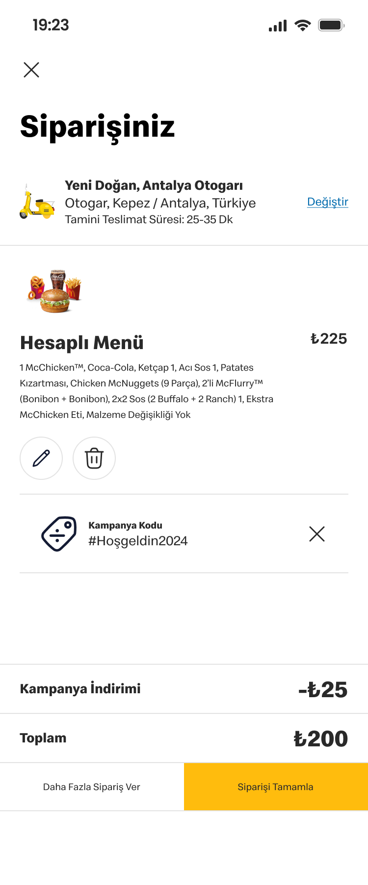
Make checkout feel certain
The order summary makes every decision visible before payment: items, modifications, discounts and total cost. Inline edit actions reduce backtracking, while the final action remains clear at the point where hesitation matters most.
- Clear summary
- Inline editing
- Focused completion
More space. Same logic.
The desktop experience expands product discovery without introducing a second interaction model. Categories remain persistent, campaign content gains room to breathe and the menu becomes easier to compare at a glance.

Persistent wayfinding
Customers can move between categories without losing context or scroll position.
High-impact campaigns
Promotions receive stronger visual presence while remaining connected to the menu.
Cross-device parity
The same hierarchy and ordering logic create confidence when customers switch screens.
One ordering system,
designed to feel obvious.